My Bucks
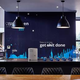
One of MyBucks’ key competitive advantages is their ability to push the frontiers of the finance sector through innovative technological platforms. To portray this fearless approach to success, a bold colour scheme of black, blue and white was used.
Finishes such as timber, copper and stone ground the interior and reflect the company’s stability and longevity, whilst pops of bright colour and digital walls look firmly to the future. Lighting acts as a tool to portray the technological side of the company. Strip lighting which runs throughout the office create a sense of flow and seamlessness.
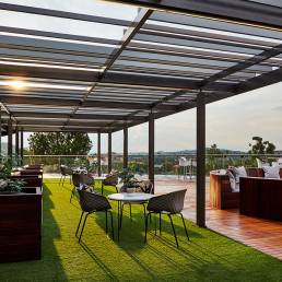
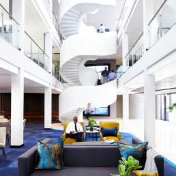
Innovation is represented throught the office by use of Smartglass and flawless Audio Visual systems. The large multi-volume space and large expanses of clear glass reflects simplicity, clarity and accessibility. The functional design of the offices empowers the employees by providing a choice of spaces, from traditional desk-based work, to quiet pods, to break away areas and even a roof garden. Slight curves were incorporated in the ceiling and shopfitting to connect the various spaces and represent the companies’ ability to seamlessly integrate financial services and technology.
LOCATION
JOHANNESBURG
YEAR
2017


